Sunday, 4 August 2013

The first try of matte painting for shot009

SH0T009 is my first try  for the conceptual design and matte painting, it requires the style exploration, I need to decide which time is this movie going to be happen, what mood we want to express to our audience and also how to keep the fresh feeling in the entire movie to avoid people feel bored.The feeling we want to make in this short film is sad, away from the noisy city .

For making the city looks colorful and gorgeous, I decided to use different colours of lights.Our liveaction maerials were shot in the daylight, it's a challenge to make it into the nighttime in colour correction and also the feeling prodution,we want the character fly far away from the world which is not belonged to him, and also make the feeling that he is in the thousand inched sky ,it 's high, dangerous and also mysterious, so ,the feeling of depthe became the most significant one in our project.

I did a lot of research in the space making, for example :the film "Total recall", "upside down", the concept of the cities and the complex spaces gave me huge inspiration .

Here's the original cleaned plate of the shot009
it looks grey and lack of contrast,not much space in the plate, so what i need to do is take the full use of the right corner to make the space as obvious as possible.


This is the first version of the matte painting for this shot. I made a daylight version in this one, which looks nice but the elevator is not suitable for our entire movie,also the quality of the matte painting is not high enough for a realistic film, it still looks like an illustration.
At that time  , I stell didnt find  a right way for the realistic matte painting, which made me really confused and stressful, I dont want my stuff couldn't be used in our project.I searched amazon and found a really helpful book called"The digital matte painting handbook"which has amazing tutorials for the beginners.

This is the final version of matte painting and colour design for the shot009:
I changed the time to night and added some high contrast colours , made the lights for highlight some area to make it more layered.Fog and smoke also be used as one neccasary element which makes the scene mysterious.

At this stage,the main colours of this film have been decided as red and blue.

Saturday, 3 August 2013

Programme of study updates

From the first animatic , I found a big problem :All the elements just crowed and placed together with no space or contract in them, also ,the whole animatic movie we've just finished has no colour in it.

My progamme of study is :concept art for the environment ,which requires a lot of elements: compostion, the contrast of colours,space etc. We prepared all the materials ready to use, but without the design for them, they will never become an successful movie.
 So in the period of time from after the texture to the end of july,my mission is :
 
1.finish all of the conceptual design for every shot

2.keep the feeling of the film with colours

3.finish the high resolution matte paintings for shot001 ,002,008,011,009.

4.keep communicating with comp team to make sure my work is benefit for their final comp work.

5.keep on doing the reference and inspiration collecting .

First animatic

http://www.youtube.com/watch?v=y22wK4bHIlU

After I ve finished the character's texture, I began to help Michael with the environment modeling in 3D. I want the effect to be damaged and complex to confuse the audience .So I created the damaged bridges and pillars for the shot 009 mainly. For the first animatic , I was in charge of the three shots which have pillars in it. I roughly placed the pillars to match the live action in Maya.

My program of study is mainly about the environmental design , this was the first try of place elements to make the composition of the shot as good as possible.


To place the elements to let them feel suitable for the scene and also have space and contrast, I didn't just put every useful details in it, i left some space for the scene to let the audience feel can breathe.

Friday, 2 August 2013

Left feet problem solved


There was a big problem poped up in the progress when i was doing the texture.We combined the feet and the main body's geometry together, but when we applied the shader to it, the left feet lost, we can't see any colour of it, it went totally black, but when I export then rendered image to nuke, it still have several information on the black part.
I tried several ways to solve it:apply lambert ;seperate the feet and the body; made a new geometry of the feet.But they didnt work properly,and it's very ugly when we rendered the character out.

I checked and scaled the renderded image from maya , found there are still bump info on it, only the colour is inorrect. Then  I checked the normal_reverse , it's finally worked!The problem is caused by uncorrect normals.
The final step of our fix problems' part is :I reversed every feet for each shot and make sure the animation is still working , then I applied the surface shader to all of the the other part of the character and rendered the feet out only since we dont have time to render the entire character out again.Michael comped all of the shoe part into the final comp at last.

The final correct render of the character:

Final texture for the character

Since the last displacement map test didnt meet  what i expected,i began to use the bump map tp create the details of the character. It's a huge amount of work because our character s armour is made up by more than 35 pieces, which means I need to make approximately the same amount of different shaders for the entire character. I chose the multi passes shader for passes render for the comp team.

For the main body part, we decided to use the material like the one on spiderman, with net bump on it.


Final render for the main body. We took several photos (upper one),as reference, i collected many iron texrures for it then edit them in photoshop.
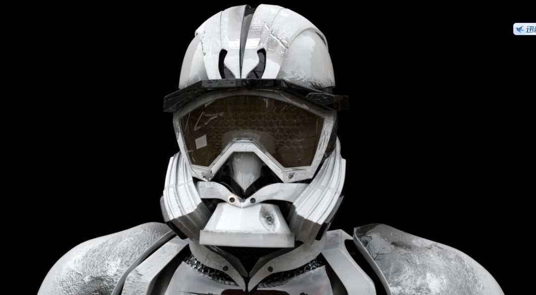
For the helmet part, i used overall bump map and standard one to make it looks like more layers and also more damaged.

.
The chest part is the most chanllenged part.Our original idea is:to make an organic heart for the character and also have a close up shot for the heart which we gave up finally.For a visual effect short movie, it's very necessaey to make all of the part as realistic as possible, but to be honest, we couldnt acheive the real heart result perfectly and we dont have any animators in our team, so I created a crack on his glass chest to make it more detailed and let the audience not focus on the heart inside,but leave the heart's red there to rich the colours.
 
The back part, also used two types of bump map.
 

Our lucky number on the leg,cracks on the armour are all made in photoshop


Saturday, 8 June 2013

First shader test


The heart sculpting and mistakes

                               Heart reference image
                       My original heart sculpting
                              Sarah's correction


I collected many reference images online for the heart for Ikaros, the first picture's texture and patterns on it are really beautiful and attractive, but the problem is :i can see the structure of heart clearly.

After i finished the first edition of the heart sculpting, i asked my roommate Sarah for help whose major is medical art. She did the correction for the heart for me(the 3rd one).

As Jin's considering, it's definately very heart to make the heart looks real , and we dont want to ruin the whole quality by the organic parts. We are still working on it, and considering whether we should keep the close-up shot for the heart or not.